Last night, while grabbing dinner at a local restaurant here in Sialkot, I couldn’t help but notice the staff uniforms. As a specialized sportswear designer, my eyes went straight to a glaring technical error on their shirts.
The design attempted a classic, aggressive look: a gradient fading from bright red at the top to solid black at the bottom.
But instead of a smooth, powerful transition, there was an ugly, desaturated “muddy brown stripe” cutting right across the chest. It immediately made the garment look cheap and poorly produced.
A common sight: The dreaded “muddy zone” where red fails to blend smoothly into black.

This isn’t just a problem for that one restaurant. In my seven years designing fightwear and sportswear for international brands, I have seen countless gyms and new brands make this exact mistake. They approve a design that looks great on a computer screen, only to receive a shipment of jerseys that look dull and unprofessional.
Today, I’m sharing why this happens and the specific technical “hack” I use at Design Artico to ensure it never happens to my clients.
Why is this specific color combination so difficult in sublimation printing?
The issue lies in the difference between light on a screen (RGB) and ink on fabric (CMYK). When you use a standard gradient tool in software like Photoshop or Illustrator to fade Pure Red into standard Black, the software struggles with the transition pixels.
As the two colors overlap, they lose saturation. Instead of creating a rich, deep maroon, they create a “dead zone”—a desaturated, brownish-grey band that ruins the aesthetic of the jersey.
Without proper technical adjustments, standard gradients create visible banding and muddy tones.
If you are building a premium fight brand, you cannot afford these kinds of technical slip-ups. Your gear needs to look as professional as your athletes.

Many designers will tell you to just use a “Rich Black” CMYK mixture. While that helps get deeper blacks, it doesn’t always fix the transition area.
I don’t rely on standard gradient tools for high-stakes color combinations. Instead, I use a technique called subtractive color mixing directly in my design software.
Here is the Design Artico Formula:
Instead of just letting red fade into black, I force color into that “dead grey zone.”
Why this works: The “Multiply” mode doesn’t just cover the area; it mathematically combines the red pigment with the underlying grey/black pixels. This instantly turns the “mud” into a deep, rich, saturated Maroon.
The result is a buttery-smooth, professional fade that looks exactly like it should on the final fabric.
The difference between a standard gradient versus my “Multiply Layer” technique.

A sportswear designer’s job isn’t just to make things look cool on Instagram. It’s to understand the engineering of printing so that the final product is flawless.
If you are a gym owner or an apparel brand frustrated with colors that don’t pop, or gradients that look muddy, you need a design partner who understands production reality.
At Design Artico, we don’t just design; we engineer files that are ready for the real world.


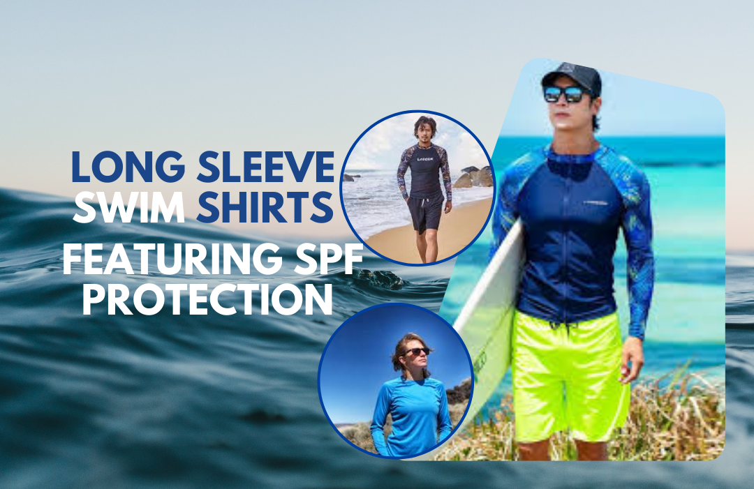
Factors to Consider Before Buying Rash Guards Online...
We all love to soak up the sun's...

Proper Storage:When it comes to maintaining the quality...

Introduction to Rash Guards Rash guards have become...

Last night, while grabbing dinner at a local...
